2009

50 Great Examples of Data Visualization | Webdesigner Depot
Wrapping your brain around data online can be challenging, especially when dealing with huge volumes of information.
And trying to find related content can also be difficult, depending on what data you’re looking for.
But data visualizations can make all of that much easier, allowing you to see the concepts that you’re learning about in a more interesting, and often more useful manner.
Below are 50 of the best data visualizations and tools for creating your own visualizations out there, covering everything from Digg activity to network connectivity to what’s currently happening on Twitter.

2006
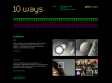
10 ways - Getty Image | Light by Sumona
At its most basic level, photography is light. Explore a multidimensional world to see how light – or its absence – can determine the mood, emotion and dramatic contrast within an image. From its content to its visual components, a photograph is filled with information. Choose a point on an image and delve deeper into it, linking one idea to another in a never-ending chain.
Multi-Touch Interaction Research
While touch sensing is commonplace for single points of contact, multi-touch sensing enables a user to interact with a system with more than one finger at a time, as in chording and bi-manual operations. Such sensing devices are inherently also able to accommodate multiple users simultaneously, which is especially useful for larger interaction scenarios such as interactive walls and tabletops.
2005

Flickr Related Tag Browser
How flash enhance the user experience via tag research linked to flickr app / see marumushi's flickrgraph or krazydad color fields colr pickr experience too

NID GALLERY /// Collection 2005
People & works from nagaoka institute of design
made by Yugop
mSpace: exploring the New Web
démarche qui va dans le même sens que les recherches faites par Laszlo Systems, Inc.

BILLY HARVEY MUSIC
created by Sofake / anything common with Matthew Mahon website design - of course, same designers sofake / wefail - fucking good !

MATTHEW MAHON
un loading des photos à la "intentionallies" une nav. similaire au site de Billy Harvey - normal design by sofake / wefail
flickr graph
Flickr Graph is an application that visualizes the social relationships inside flickr.com. It makes use of the classic attraction-repulsion algorithm for graphs. Start exploring your contacts by entering your flickr username or the email address you used to register there.
Thinkmap visualization software facilitates communication, learning, and discovery.
Thinkmap provides dynamic, Data-driven, visualisation technology. Need to visualize complex data ?


intentionallies
ITL Tokyo Japan / interiors / Architecture / Product Design / Exhibitions
2004
FM FESTIVAL '04
intentionnallies like with a japan music map / votes / lives designed by yugop
1
(19 marks)
